
Forging a new identity for Anvil
Anvil
Roles:
Research
User Experience
User Interface
Photography
Identity
Description
Kimo, the owner, and sole instructor chose the name Anvil because it represented the platform to reshape and reform something, or as he likes to say ‘to break your chains.’ To him, fitness is all about mentally and physically pushing yourself into new possibilities and living a life that comes with that.
Challenge
When Kimo asked me to refresh his gyms branding, I knew I wanted to start the process by experiencing his training. Kimo approaches fitness as a holistic endeavor that’s equal parts physical therapy, strength training, and range of motion. I spent time with him and other clients in the gym documenting through photography and seeing first hand how his work impacts peoples lives.
Approach
The design for Anvil needed to be impactful to represent what Kimo does accurately. He’s also a long-time snowboarder, and we wanted it to express that spirit. I designed a more bold and iconic anvil mark that also has the effect of looking like a person. We looked at color palettes and settled on one that has more intensity and felt like it was representative of the forging process. I created business cards that have the logo mark embossed to reinforce the forging theme. I finished with a single page website that focuses on his approach, schedule, and contact information.
Outcome
Both Kimo and clients alike loved the new branding and felt like it accurately represented who Anvil Fitness was all along.
![]()
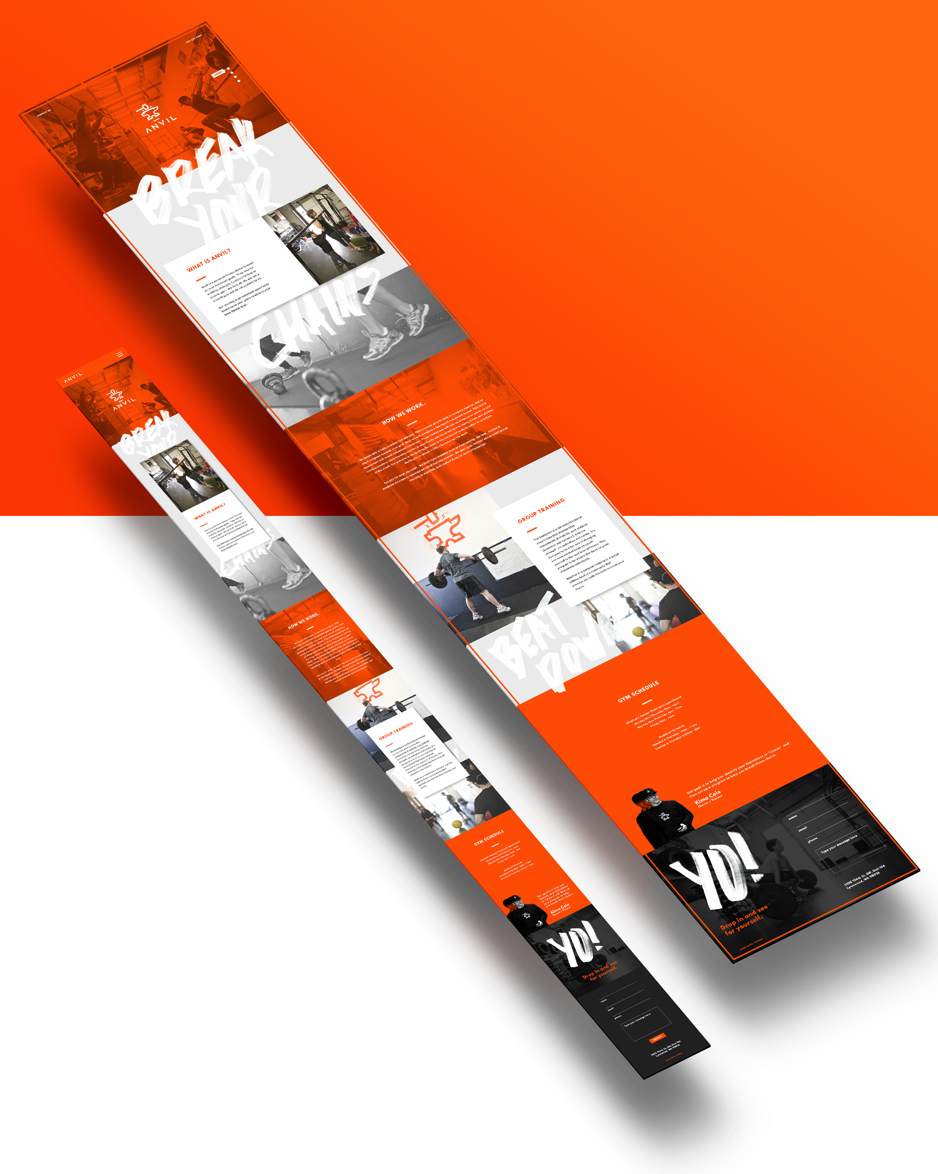
Website
The site is designed with mobile-first principles, and our approach to the content was to keep it as simple as possible so that Kimo doesn’t need to update it regularly. A detail we incorporated into the site was the use of hand-drawn typography of Kimo’s motto ‘Break your chains.’ We then applied a subtle parallax background effect to it. I also implemented some fresh photography I captured while documenting the classes.
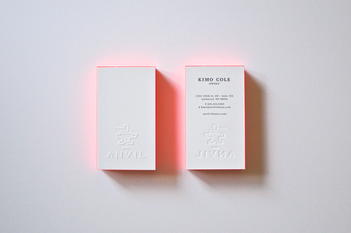
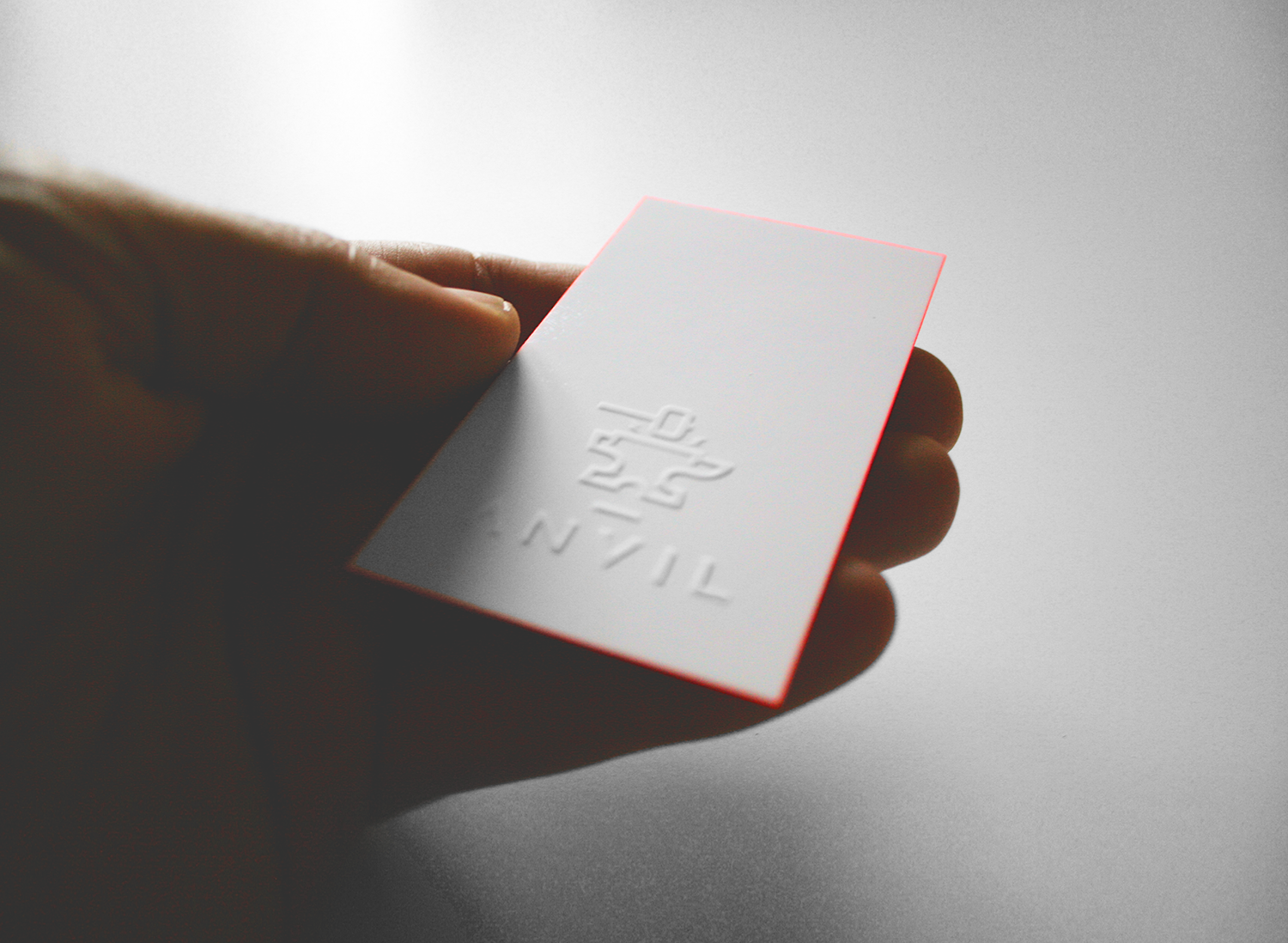
Business Cards
The text on the business cards is professionally printed, but all the other details are handcrafted. We blocked the business cards together and painted the edges in neon orange, we then had an embosser made with his new logo and hand embossed the cards. The end result is a card that when set down on a table, creates an orange glow around it looking like it was just forged.